Tuesday, May 13, 2008
Wednesday, April 30, 2008
Thursday, April 17, 2008
Map Festival
The map festival in Baltimore had an interesting assortment of maps that were collected throughout the course of time. The maps that caught my eye were the ones showing American exploration in the early 1800's, as well as the maps of the American Revolution and American Civil War. Perhaps this is because I find these periods in time to be of most interest, as I am a big fan of American history. The map showing Lewis and Clark's exploration to the Pacific Northwest by way of the Missouri River is interesting due to the fact that such a large chunk of land was relatively unknown only 200 years ago. When you compare some of the American maps to the middle-aged European maps or the maps of ancient Asia, it really puts in perspective just how young this country is. Of course I have to mention the American Civil War shape tween map that was in the last room of the first floor. When I was doing my own shape tween for the map of Russia, I was close minded to how useful the technique could be. I'm just glad you didn't make us do a separate shape tween for individual battles as I believe that map had. I was disappointed that the map was not touch screen so that the timeline could be controlled, but I guess I'm being picky.
But, the most interesting map on hand (corny I know) was not a traditional map, but a map that was placed on a glove. What confused me most about the map was that the buildings placed on the fingers of the glove could be changed in terms of location. Location and perhaps distance would only be accurate if the fingers of the glove were close together. But in terms of creativity I felt that was the best. Another map that I found interesting was the literacy (or illiteracy) of men in England in either the 1500's or 1600's. When I looked at it, I wondered "how could they possibly obtain records for who was literate and who was not during that time period?" Education was not nearly as formal as it is today, so I really wasn’t sure how it was collected. But, when I read the caption to the side of the map it was the number of men who signed "x" and not their name on the marriage certificate. I had never thought of that in terms of finding illiteracy, which was interesting to learn. But, I presume that the percentage of men that were married is much higher than it is now because that would cause for an incomplete study. Nevertheless, this map highlights the several different types of data maps are used for. The globes on the third floor were also interesting despite the fact they were the only globes at the exhibit. A guy dressed in Renaissance attire pointed Ben and me in the right direction of the globes because we looked lost and circled him several times. He explained that both globes are needed simultaneously, as one was needed for location/ geographic purpose and the other for the constellations. I was going to ask him more questions about it, but he disappeared. Maybe I just imagined him.
If I were to go back, I would spend more time in the first room where I believe some of the older maps are. Since I’m impatient and hate being crowded, I did not spend as much time in there since every time I went back in, there were a million people congregated in the room (I don't know what Martha is talking about). They must have stopped patrolling the number of people they let in, after they let us in. Also, other than the globes placed on the third floor and the map that was on the wall once you walked out of the elevator, I didn’t see much else that was map or geography related. This is despite the fact that they had signs saying “maps” and arrows pointing in a certain direction. In addition, a guard working the map festival claimed there were “several” maps on the second and third floor, but I won’t hold that against her. But, looking for the maps led me to the art exhibit and paintings. I spent the better part of an hour looking at some of the works depicting Jesus which was really interesting. But as for the maps, the one thing I took from it is that they are often made for people who are not familiar with the area or history of the land. As a result, mapmakers have the task of explaining an area without the luxury of words, which to me is really intriguing.
Oh yeah, what is the deal with the hats? I asked for one and they said they only give them to kids. Yet, I saw several adults wearing one. No need to lie. That took the overall experience of the trip from good to fair.
Thursday, April 10, 2008
lab10
 Civil War battle map focusing on Virginia.
 Bull Run map, first battle in Virginia during American Civil War.
 Thursday, April 3, 2008

Thursday, March 27, 2008
lab8
DavidLabban_Lab8b.kmz
The link works. Oh yeah, I guess my cruise isn't really a cruise, I guess it is more of a mission. It takes weeks.
The link works. Oh yeah, I guess my cruise isn't really a cruise, I guess it is more of a mission. It takes weeks.
Sunday, March 23, 2008
Tuesday, March 4, 2008
map brief
Morphing Effects and Animation - Shape Tween
The term “tween” or “tweening” comes from the root word “between”. Shape tween is when the first and last shapes are specified, so that the frames in between are produced by using the authoring tool. Flash is only capable to tween vector based shapes. The biggest difference between shape tween and motion tween is that motion tweens are able to work with groups and symbols. Shape tween requires the group or symbol to be broken apart. There are also two types of animation referred to as morph and skeletal animation. Morph animation is different from skeletal animation as morph animation is much more conducive to objects that drastically change shape.
This example is probably the simplest form of shape tweening, as the size, shape, and color of the object changes in one fluid motion.
http://www.webdevelopersnotes.com/tutorials/adflash/shape_tweening_in_flash.php3
1. This example of morphing is of a flat map transforming into a globe of the world. The interactivity of this map is decent as it is in QuickTime and the user is able to click at their own pace and leisure. Below in the Storyboard, five clips of the most important phases in the transformation are captured. The downside of this example, however is that it gets pretty redundant in the last 30 seconds as the globe just keeps spinning.
http://www.gettyimages.com/search/detail.aspx?id=ev00172&esource=feed_google_video
2. Although this morphing takes place in QuickTime as well, the transition of the tube to a soccer ball (and vice versa) makes a smooth transition without tearing it or any jerky movements. The transparency is also helpful in understanding how the transformation is made. It is also interesting to see the different shapes that occur between the opening “tube” shape and the final “sphere (such as “peanut shaped objects”). The “folding of a soccer ball” example also shows how simple shapes such as hexagons and pentagons are used in creating complicated morphing animations. The “breathing” soccer ball example shows how shapes can be recaptured numerous times within the timeline.
http://www.mathematicaguidebooks.org/soccer/
3. This map begins with the land area of each country, and then each country begins to morph due to various categories such as underweight children to number of fast food chains. This map is effective in correlating the categories as the order the map morphed in does not appear to be by accident (such as morphing from poor water to cholera). However, there are a few downsides to this particular example. I can not figure out if there are any controls for this map and realized the map was continuing to morph even after five minutes. But, I was pleased to find a map example of morphing animation.
http://www.worldmapper.org/#
http://worldmapper.sasi.group.shef.ac.uk/animations/sheffield_animation.html
4. It seems difficult to find a good example of a map that morphs but here is an interesting concept of the Central line in London; its location geographically is positioned much differently than it is on the Underground maps of London. I wonder if many subway lines around the world are placed inaccurately on maps. Too bad the clip of the map is on youtube so it can’t be slowed down and it only lasts three seconds.
http://rooreynolds.com/2007/02/28/map-morphing/
5. I guess this map of the contiguous United States would constitute as a map that changes shape, as some of the states change shape over a prolonged period of time. However, there are no controls for this map, and its layout is quite simple.
http://www.ac.wwu.edu/~stephan/48states.html
This example is a little better than the previous map as it is much more comprehensive, and in addition, I am able to control the map with the buttons and slider provided. But, again it’s not as fluid as the other morphing examples, and you really can’t tell the change in shape unless you are looking for a specific state, such as Virginia.
http://www.animatedatlas.com/movie.html
Additional Sites about Morphing
About flash- http://www.oman3d.com/tutorials/flash/morphing_bc/
Morphing in Pop Culture
http://www.morphthing.com/
Wednesday, February 27, 2008
Wednesday, February 20, 2008
Lab 3 and 4
Thank God. Because the Giants won the Super Bowl and I'm done with this lab.
http://www.swfup.com/uploads/swf-134722.swf
http://www.swfup.com/uploads/swf-134722.swf
Thursday, February 7, 2008

Thursday, January 31, 2008


Wednesday, January 23, 2008
http://www.telegraph.co.uk/news/main.jhtml?menuId=6770&menuItemId=10310&view=DISPLAYCONTENT&grid=A1&targetRule=1
UK General election political map
UK General election political map

Thursday, December 6, 2007
extra credit
MAPS FOUND ON INTERNET
I thought this map was neat in that it split America into different regions based upon MLB team affiliation. It is interesting that the state borders were not included on the map, but it still works really well.
https://blogger.googleusercontent.com/img/b/R29vZ2xl/AVvXsEgK9H32uNhmn-4_yXKjCRp8zGSc-_b_e2Pbt1iKtdXL8iHO963uca0paQtM7fEkNjY8k5RymDO5tXrqy4Qk7G9VKq8TO033tapYQTcigaARYUgx75aBDoZP56afn9kuO_9X9sfZ-7QU6II/s1600-h/Baseball+Map.jpg
I really enjoy the chernoff face maps and thought this map utilized the concept to the fullest. It shows that a variable like health can alter in such a small area, but that’s “Chicagoland” for you!
https://blogger.googleusercontent.com/img/b/R29vZ2xl/AVvXsEgWL7-xTIrz6GF1STM0SXOY_wR6lHr0qMHtCUe1bkwJs7zENcEBhhoFJVWl6g6_XLsS0T7n2QF2R9wt_ozsU5r1UF4Z8NRRcN8Vklzxl54_B31-kxr-wSmuqWZo-eHcKTopPXtcFxCqrSoG/s1600-h/4b.jpg
I liked this map projection because of the excellent color choice. The black background really made it stand out.
https://blogger.googleusercontent.com/img/b/R29vZ2xl/AVvXsEg6G8H_joZAVifjbCNLcmJMzHjADpdKpjY6T6ggRuUV56u6N3quNDWZvaZ5Vz-VPBDLg5iBkYBTCvUTzJZ2q1gbYQIYOUOJIXAj4FpMZLPE_7L7vgl3lli6if1fDzZHpLWefykqxQgV3cvW/s1600-h/azimuthal.bmp
I thought this map was effective in highlighting the technology savvy regions of the world by way of video game play over the internet. If this map used data from 3:15 P.M EST, that would explain why Asia and perhaps Australia don’t have more dots.
https://blogger.googleusercontent.com/img/b/R29vZ2xl/AVvXsEi2PM0X830i7L9FYtZCWDVpwMe5s6tOoaqflav20WuTUwEcxLiXhavs0JpuN0kKVZYzNLh6LsflfudyN2FCaml3V-grh4sslEaWqZW4tz78xO_BulmhwZujTzfQyWBGyxu7hZnG9RVybBI/s1600-h/Bungie.JPG
I thought this map was effective because it seems as if Alaska Natives and American Indians are the least mapped of race demographics in the United States. I wish the map showed how many people a dot represents because I didn’t realize that either race is that prevalent throughout the US.
https://blogger.googleusercontent.com/img/b/R29vZ2xl/AVvXsEjAnlMWsUPJRsZUXiaCwXTAD7Uto23KbVPp6_INc0iXTj1qkvPaBMICDKDCkxiBfSZEiCGpUCFzAjX-x0KpPySx1pVDAZ-QMlG-IgKe1xA4SZto7SXmqR-GPtgvypuyrnjNRTQXQI_C3Zqs/s1600-h/elderly_aian_big.jpg
CLASSMATE MADE MAPS
I thought this map of West Virginia really stood out due to the state being in a cream color instead of the standard white. The grey background is probably the reason for this.
http://3.bp.blogspot.com/_rF50056xTLo/Rzhkt94pjpI/AAAAAAAAAFQ/J7aKAowt8do/s1600-h/310-Lab-for-Irish.jpg
I thought the symbol on this map was outstanding and really captured my attention. I also think the green color scheme to represent the total number of farms does the map justice.
https://blogger.googleusercontent.com/img/b/R29vZ2xl/AVvXsEj-lIn3oQtKlZWhNz-hf6qEjXNlTr6dz7q7N9ZYtSEFMy0EaUesagr57hmVnUGYEBbGMD72JSOJDm-T3fgb13TWbbFmUigtl1PUbPd8tGsWQL7ZAkZbAhdHC4G87BfrlXcutZIEruBR-Rg/s1600-h/NC-+FARMS+and+CORN+(2).jpg
The first thing I noticed about this map was the rounded edges of the neatline which is a change from the standard square neatline. I also thought it was a clever idea to put a slash through the graduation hat symbol to represent the population with no high school diploma.
https://blogger.googleusercontent.com/img/b/R29vZ2xl/AVvXsEg2TAcmOw9VAiFUvFasmMIOPQF4Aui5rMU85MLy4C5YLnJuuYtduRSiBV9AT6SiJSP5clxsEk3-7RLGcT4BC7GuzHaRUGlrK419Xwu3mvlOqji35fwnsHvvEfxttmBRFtoVLOs2dNEiPBk/s1600-h/Lab10.jpg
I thought this map did a good job of not making the legend box to big, making the state itself the focus of the map. I also thought the subtle detail of the house (like the white door) enhances the presence of the map.
https://blogger.googleusercontent.com/img/b/R29vZ2xl/AVvXsEg0U9Dlle-g6zt0Nj-81XWYV0Y5gbSfd2lQoOaB2qbE7itTmyVTVovaOabO-YBP71JCiiZMy8l2L9ilo7NLoNdgWwJMrXNXv6gQb9yztISwAJIERlpD3ntMH1cdkwY74WC08pFC07M_b60/s1600-h/Lab_7.jpg
I liked this map a lot because of the realistic look of the symbol. I also liked the use of the brown color scheme because it conveys the construction theme really well.
http://3.bp.blogspot.com/_zDE4jMmL-yY/R0NDw9o6BZI/AAAAAAAAAB0/vYjbAQ06mys/s1600-h/nclab1.jpg
Monday, November 26, 2007

Saturday, November 24, 2007
 This is a side-by-side bivariate map. Kind of hard to find.
http://www.geog.le.ac.uk/russianheartland/DemographicMaps/images/PopulationMaps/RaionMaps/7RaionPopDenPerCh8902.jpg
Wednesday, November 14, 2007
Color map
 Since this lab is being graded on the web, this was the first time when the layout was the main focus. As you can tell from my greyscale map, I never really took the time in trying to fix my layout and I found it to be pretty difficult. As for the color, I find the web version to be quite dull but it may be just the screen. The blues seem to be more similar on the web version but on the printed version each shade of blue really stands out.
Wednesday, November 7, 2007

Sunday, November 4, 2007
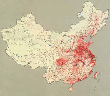
Dot density map of China's population. A dot represents 50,000 people.
Source:http://depts.washington.edu/chinaciv/geo/1zgzpopu.jpg
Wednesday, October 31, 2007

Thursday, October 25, 2007

Wednesday, October 24, 2007


Sunday, October 7, 2007

http://www-groups.dcs.st-and.ac.uk/~history/HistTopics/Cartography.html
Here is an example of a map Eratosthenes would have constructed sometime in the 200's BC. I picked this map because the labels had to be carefully placed to represent proper location.
 oh, we were suppose to post a map with interesting fonts instead of the one I posted on October 1st. Anyway, I picked this map because only pirate maps could fit so many different labels on one map, plus their use of small fonts is always intriguing. And, you don't see scales like this everyday.
http://pirateshold.buccaneersoft.com/images/maps/guinea-map.jpg
Thursday, October 4, 2007

.jpg)
Monday, October 1, 2007

Here is a map of the US but instead of putting in state names, coutries with comparable GDP's are used instead. Amazing.
Subscribe to:
Posts (Atom)