
Wednesday, December 12, 2007
Thursday, December 6, 2007
extra credit
MAPS FOUND ON INTERNET
I thought this map was neat in that it split America into different regions based upon MLB team affiliation. It is interesting that the state borders were not included on the map, but it still works really well.
https://blogger.googleusercontent.com/img/b/R29vZ2xl/AVvXsEgK9H32uNhmn-4_yXKjCRp8zGSc-_b_e2Pbt1iKtdXL8iHO963uca0paQtM7fEkNjY8k5RymDO5tXrqy4Qk7G9VKq8TO033tapYQTcigaARYUgx75aBDoZP56afn9kuO_9X9sfZ-7QU6II/s1600-h/Baseball+Map.jpg
I really enjoy the chernoff face maps and thought this map utilized the concept to the fullest. It shows that a variable like health can alter in such a small area, but that’s “Chicagoland” for you!
https://blogger.googleusercontent.com/img/b/R29vZ2xl/AVvXsEgWL7-xTIrz6GF1STM0SXOY_wR6lHr0qMHtCUe1bkwJs7zENcEBhhoFJVWl6g6_XLsS0T7n2QF2R9wt_ozsU5r1UF4Z8NRRcN8Vklzxl54_B31-kxr-wSmuqWZo-eHcKTopPXtcFxCqrSoG/s1600-h/4b.jpg
I liked this map projection because of the excellent color choice. The black background really made it stand out.
https://blogger.googleusercontent.com/img/b/R29vZ2xl/AVvXsEg6G8H_joZAVifjbCNLcmJMzHjADpdKpjY6T6ggRuUV56u6N3quNDWZvaZ5Vz-VPBDLg5iBkYBTCvUTzJZ2q1gbYQIYOUOJIXAj4FpMZLPE_7L7vgl3lli6if1fDzZHpLWefykqxQgV3cvW/s1600-h/azimuthal.bmp
I thought this map was effective in highlighting the technology savvy regions of the world by way of video game play over the internet. If this map used data from 3:15 P.M EST, that would explain why Asia and perhaps Australia don’t have more dots.
https://blogger.googleusercontent.com/img/b/R29vZ2xl/AVvXsEi2PM0X830i7L9FYtZCWDVpwMe5s6tOoaqflav20WuTUwEcxLiXhavs0JpuN0kKVZYzNLh6LsflfudyN2FCaml3V-grh4sslEaWqZW4tz78xO_BulmhwZujTzfQyWBGyxu7hZnG9RVybBI/s1600-h/Bungie.JPG
I thought this map was effective because it seems as if Alaska Natives and American Indians are the least mapped of race demographics in the United States. I wish the map showed how many people a dot represents because I didn’t realize that either race is that prevalent throughout the US.
https://blogger.googleusercontent.com/img/b/R29vZ2xl/AVvXsEjAnlMWsUPJRsZUXiaCwXTAD7Uto23KbVPp6_INc0iXTj1qkvPaBMICDKDCkxiBfSZEiCGpUCFzAjX-x0KpPySx1pVDAZ-QMlG-IgKe1xA4SZto7SXmqR-GPtgvypuyrnjNRTQXQI_C3Zqs/s1600-h/elderly_aian_big.jpg
CLASSMATE MADE MAPS
I thought this map of West Virginia really stood out due to the state being in a cream color instead of the standard white. The grey background is probably the reason for this.
http://3.bp.blogspot.com/_rF50056xTLo/Rzhkt94pjpI/AAAAAAAAAFQ/J7aKAowt8do/s1600-h/310-Lab-for-Irish.jpg
I thought the symbol on this map was outstanding and really captured my attention. I also think the green color scheme to represent the total number of farms does the map justice.
https://blogger.googleusercontent.com/img/b/R29vZ2xl/AVvXsEj-lIn3oQtKlZWhNz-hf6qEjXNlTr6dz7q7N9ZYtSEFMy0EaUesagr57hmVnUGYEBbGMD72JSOJDm-T3fgb13TWbbFmUigtl1PUbPd8tGsWQL7ZAkZbAhdHC4G87BfrlXcutZIEruBR-Rg/s1600-h/NC-+FARMS+and+CORN+(2).jpg
The first thing I noticed about this map was the rounded edges of the neatline which is a change from the standard square neatline. I also thought it was a clever idea to put a slash through the graduation hat symbol to represent the population with no high school diploma.
https://blogger.googleusercontent.com/img/b/R29vZ2xl/AVvXsEg2TAcmOw9VAiFUvFasmMIOPQF4Aui5rMU85MLy4C5YLnJuuYtduRSiBV9AT6SiJSP5clxsEk3-7RLGcT4BC7GuzHaRUGlrK419Xwu3mvlOqji35fwnsHvvEfxttmBRFtoVLOs2dNEiPBk/s1600-h/Lab10.jpg
I thought this map did a good job of not making the legend box to big, making the state itself the focus of the map. I also thought the subtle detail of the house (like the white door) enhances the presence of the map.
https://blogger.googleusercontent.com/img/b/R29vZ2xl/AVvXsEg0U9Dlle-g6zt0Nj-81XWYV0Y5gbSfd2lQoOaB2qbE7itTmyVTVovaOabO-YBP71JCiiZMy8l2L9ilo7NLoNdgWwJMrXNXv6gQb9yztISwAJIERlpD3ntMH1cdkwY74WC08pFC07M_b60/s1600-h/Lab_7.jpg
I liked this map a lot because of the realistic look of the symbol. I also liked the use of the brown color scheme because it conveys the construction theme really well.
http://3.bp.blogspot.com/_zDE4jMmL-yY/R0NDw9o6BZI/AAAAAAAAAB0/vYjbAQ06mys/s1600-h/nclab1.jpg
Monday, November 26, 2007

Saturday, November 24, 2007
 This is a side-by-side bivariate map. Kind of hard to find.
http://www.geog.le.ac.uk/russianheartland/DemographicMaps/images/PopulationMaps/RaionMaps/7RaionPopDenPerCh8902.jpg
Wednesday, November 14, 2007
Color map
 Since this lab is being graded on the web, this was the first time when the layout was the main focus. As you can tell from my greyscale map, I never really took the time in trying to fix my layout and I found it to be pretty difficult. As for the color, I find the web version to be quite dull but it may be just the screen. The blues seem to be more similar on the web version but on the printed version each shade of blue really stands out.
Wednesday, November 7, 2007

Sunday, November 4, 2007
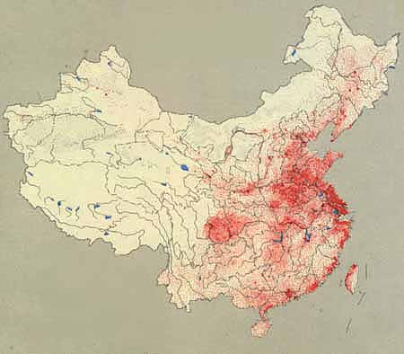
Dot density map of China's population. A dot represents 50,000 people.
Source:http://depts.washington.edu/chinaciv/geo/1zgzpopu.jpg
Wednesday, October 31, 2007

Thursday, October 25, 2007

Wednesday, October 24, 2007


Sunday, October 7, 2007

http://www-groups.dcs.st-and.ac.uk/~history/HistTopics/Cartography.html
Here is an example of a map Eratosthenes would have constructed sometime in the 200's BC. I picked this map because the labels had to be carefully placed to represent proper location.
 oh, we were suppose to post a map with interesting fonts instead of the one I posted on October 1st. Anyway, I picked this map because only pirate maps could fit so many different labels on one map, plus their use of small fonts is always intriguing. And, you don't see scales like this everyday.
http://pirateshold.buccaneersoft.com/images/maps/guinea-map.jpg
Thursday, October 4, 2007

Monday, October 1, 2007

Here is a map of the US but instead of putting in state names, coutries with comparable GDP's are used instead. Amazing.
Thursday, September 27, 2007

Tuesday, September 25, 2007
 http://www.colorado.edu/geography/gcraft/notes/mapproj/mapproj_f.html
I thought this projection was interesting because both the scale and the shape is somewhat distorted, but shows a large country such as the US quite well because its area is accurate across standard parallels.
Thursday, September 20, 2007

.jpg)
Wednesday, September 12, 2007
Websites of Possible Interest
The GIS Development website gives a comprehensive overview on the different applications of GIS. GIS applications range from Urban Planning to Agriculture to Business, and shows just how integral GIS has become in several fields and professions. http://www.gisdevelopment.net/
The need for cartographers is at a all time high around several counties across the country. The Careers in Cartography/GIS website is a good site which explains the procedure to lucrative, and interesting Cartography jobs. http://www.acsm.net/CaGISCareerWeb/index.html
The GIS and Mapping Crime website is an interesting site that details the relationship between crime mapping and cartography. Crime is of some interest to everyone since many decisions we make is affected by it. http://www.ojp.usdoj.gov/ovc/publications/infores/geoinfosys2003/welcome.html
Subscribe to:
Posts (Atom)